Web
Dear Amazon,
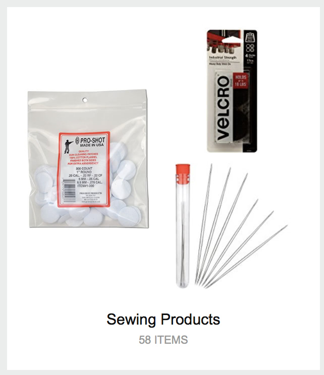
The reason I miss the old “recommended for you” paginated, categorized list is that your new tag-tile system constantly throws up nonsense like this:

Bottom line, the behavior that your new tile system encourages is anti-browsing: if the picture on a tile isn’t something that I want, I won’t click on that category at all. For now, it’s still possible to get the old list view for new and upcoming releases, which you don’t (usually) have a tile for, but the URLs aren’t visible on the site any more.
I should also point out that the tile system makes it much harder to improve recommendations. Old and busted: for each item, click “I own it” or “Not interested”. New hotness:
- click a tile
- click “View All & Manage”
- click “Edit Recommendations”
- click “Remove” on an item
- click either “I already own this item” or “I’m not interested in this item”
- wait for the thumbnail image to load, because your next click might not register when the layout changes
- click “Ok”.
- Repeat steps 4-7 for each item from that tile, then scroll back to the top and click “Yournamehere’s Amazon” to get back to the tag-tiles screen.
This, in a word, is bullshit.
Dear Adobe,
I just got email touting the new “Adobe XD CC” app, which promises:
“The future of experience design. No experience required.”
This sounds like exactly what happened when Apple set fire to their
decades of usability studies and sucked on a pistol Boldly
Invented New Paradigms.
Dear wine.com,
Please fire the web designer who thinks there should be a maximum password length (16) on your site. There are only two possibilities for this stupidity:
- you’re storing cleartext passwords rather than a hash.
- your webclowns don’t realize that the length of a salted hash has no relationship to the length of a user’s password.
I’d prefer to believe #2, but since there’s a good chance of #1, I won’t be leaving a credit card on file…
Dear Amazon,
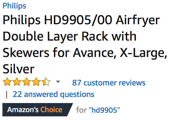
Recently, the following graphic has been showing up on a lot of products:
At first glance, it seems like it’s saying “we think this is the best product of this type”. But then you start to notice:


Doesn’t really mean much now, does it?
Crybullies on strike
I hate to break it to them, but a day without the Tumblr Social Justice Vortex is like a day with sunshine…

If they were self-aware, they’d realize that “removing hate speech from Tumblr” would wipe them out as well, leaving nothing but cat gifs and naked asian models.
So, win-win scenario here.
Dear Google,
If I open Google Maps and search for “gyro”, results that include Burger King, Chuck E Cheese, Jack In The Box, wine bars, taco joints, sushi, and chinese restaurants are not useful.
Too late, Darwin, too late
The story of the 19-year-old who killed her boyfriend while trying to make a Youtube video sets a new record in “hold my beer and watch this” stupidity, while both shooter and shot were cold sober at the time.
-
He convinced her it was safe, because he’d shot at a book before and the bullet didn’t go all the way through it.
-
She believed this claim.
-
He held the book against his chest.
-
She shot from one foot away.
-
With a .50 AE Desert Eagle.
-
With their 3-year-old daughter nearby. (do the math, 18-year-old knocked up 15-year-old that he started dating when she was 13)
-
While pregnant with their second child.
-
All of this was announced in advance, both online and to friends and family, who couldn’t talk them out of it but took no steps to actually stop them.
The words “tragic” and “accident” are twisted out of shape to cover this dangerous, reckless, deliberate, stupid stunt, which was designed to make these two imbeciles Youtube celebrities.
Predictable “if only we had more gun control” arguments are being made, but fall to pieces if you so much as breathe on them, because people stupid enough to do this are doing other stupid things. If she hadn’t killed him, they’d likely have killed their daughter eventually with carelessly stored household chemicals, matches, etc.
Fun with Hugo themes
One of the challenges with Hugo is that, out of the box, it doesn’t do anything. Create a site, fill it with content, run the generator, and you get… nothing. You need to download or create a theme in order to actually render your content; there isn’t one built into the site-creator, although several volunteers are working on something (much the same way that usable documentation is largely a volunteer effort).
It is not immediately obvious that the theme gallery is sorted by update date, so that the farther down the list you go, the less likely they are to work. There’s a top-level set of feature tags, but they’re applied by the theme authors, and don’t include useful things like “scales beyond 100 pages”.
As part of my ongoing MasterCook molesting, I decided to take the now-sane XML files and render them to Hugo’s mix of TOML and Markdown, generating a static cookbook site with sections and categories. Having done some experimentation in response to a forum post, I knew that a site with 56,842 pages would take several minutes to build, so I grabbed the simple, clean Zen theme and fired it off.
And waited. And waited. And watched the memory usage climb to over 40GB of compressed pages.
The Hugo developers pride themselves on rendering speed, but when I checked the disk, it was taking upwards of a second to render a single content page. Looking at one of them made it obvious why: the theme designer included every content page in the dropdown menus and sidebar. It had honestly never occurred to him that someone might have more than about 8 categories with about 20 pages each. In fairness, this is a port of a Drupal theme, and the original might have had the same problem.
After modifying the templates to only use the first 20 from each category, I got the site to render in about 10 minutes. The category menu looks horrible, because I split the recipes up alphabetically into chunks of about a thousand, and the theme only allocated enough space for about 2/3 of them, with the rest covering the title field. The actual recipe rendering is excellent, including the handling of sub-recipes and referenced recipes.
I could modify the Zen theme until it did everything right, or spend several hours rebuilding a small sample site with other themes until I found one that required less work, but once you’ve built one theme from scratch, it’s just faster and easier to do that than to try to use any of the pre-built themes. Their real value is as examples of “how do you do this in Hugo”, which you can’t generally find in the documentation.
There are also quite a few working code snippets in the forums (some provided by me; problem-solving is kinda my thing, if you haven’t guessed by now), but with so much of the code under active development, any forum example more than a few months old is likely to be wrong now.
It’ll be a while before I bring the cookbook back up, since this is definitely a copious-free-time project, and not only do I have to knock together a theme and set up search (most likely Xapian Omega again, since I’m fresh on it), but also molest the recipe data and impose some consistency on categorization, tagging, and ingredient naming. Currently it has 782 distinct categories, many of which differ by only a few characters, and about 2/3 of them should really be tags instead. All of these issues should really be fixed in the MX2 files, so that they can be cleanly imported back into MasterCook, but since that’s not XML, the scripting is a little more “interesting”.
Tentatively, I’m going to start with my blog theme, since I’ve already
tested it at
scale
(and learned that large taxonomies are a significant bottleneck). I
can strip out a lot of the blog-specific stuff without much effort,
I’ve already done the work to switch over to dropdown menus for
categorization, so the only real trick will be embedding any
referenced recipes in a hidden DIV at the bottom of each page, and
setting up a print-only stylesheet that hides the nav and exposes the
embedded recipes. The references are already turned into links to the
appropriate recipe’s page, thanks to the builtin relref shortcode.
