“I grabbed the arm of [NYC Police Commissioner Bernard Kerik], and I said, Bernie, thank God that George Bush is president of the United States.”
— Rudy Giuliani, on his first reaction to 9/11
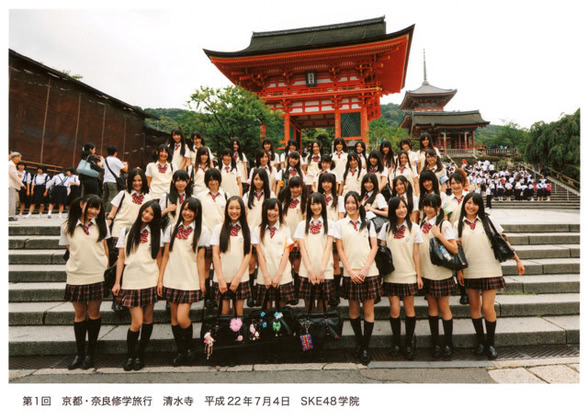
Shōwa versus Heisei
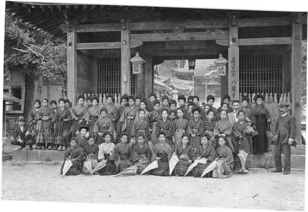
(via)
On February 24th, we find out what comes next; despite the boost it would produce for the Olympics, I suspect it won’t be the Nekomimi era.

(via)
"You stay classy, NYT"
NYT McCain obit all about Trump.
Refrigerate After Opening
When you’ve hired a top model for the whole day, but run out of photo ideas, of course you put her in the pantry. Although, honestly, I see a box of Jell-O in there, so if you need inspiration…

(via)
Fun with dotfiles
When booting OpenBSD 6.3 (at least), the /etc/rc startup script
reads /root/.profile. This can produce some rather entertaining boot
failures, including things like syslogd timing out on startup,
preventing you from getting any log data about what might be wrong…
I’m quite certain this wasn’t the case in earlier releases, but I’m not sure when it crept in.
# Simple confirmation:
echo sleep 60 >> /root/.profile
reboot
# It will take an extra ~8 minutes to boot
It looks like they try to work around this by setting HOME=/ in
/etc/rc, and having a separate /.profile, but it doesn’t work; it
still reads /root/.profile.
Ah, there it is! /etc/rc.d/rc.subr:
...
rc_start() {
        ${rcexec} "${daemon} ${daemon_flags}"
}

...

[ -z "${daemon_user}" ] && daemon_user=root

...

rcexec="su -l -c ${daemon_class} -s /bin/sh ${daemon_user} -c"
So, anything executed from a proper start/stop rc script gets executed
in a fresh su -l session (even if it’s running as root), and that
resets $HOME.
The machine I was upgrading pre-dates the rc.d scripts, so it didn’t have the problem.
-dSAFER considered harmful...
When L. Peter Deutsch first added the file I/O operators to
Ghostscript (1992?), I submitted a security patch to disable them by
default, requiring you to use -dUNSAFE to enable them. He accepted
the patch but reversed the logic, enabling them unless you provided
the -dSAFER option. I no longer remember precisely how he handwaved
away my concerns in his email, but it doesn’t matter.
I was right then, and I’m still right.
(At the same time, I also submitted a patch to the crude -dASCIIOUT
option to make it possible to extract the text correctly and
post-process it into a document that preserved formatting pretty well,
but he only accepted half of it, because he was concerned that adding
a Perl script to the base distribution would impair its portability…)

Pixiv: Azur Lane
All I know about the mobile game Azur Lane is that it’s causing a new flood of shipgirl cheesecake. That’s not a complaint.
")
[oddly, this image has been deleted from Pixiv, so I can’t link back to the creator. Unfortunately, my SQLite cache doesn’t have author IDs in it.]