Japan
弱肉強食
I’m always intrigued when a kanji study guide includes “unlikely” vocabulary choices, such as today’s surprise proverb, 弱肉強食. The four characters are common and important, and taught fairly early in most books, but the combination isn’t a phrase most students will use, and one hopes that they won’t be hearing it much, either.
Loosely translated, it’s “the strong eat the weak”.
Another one that jumped out at me was 帰国子女, “children who return to Japan after living abroad”. It’s a lot more useful, especially if, like me, you were trying to figure out the meaning of the title of the light novel 彼女は帰星子女.
Dear Microsoft,
Contrary to your claim, most web sites do not in fact explicitly specify their language setting in a fashion compatible with your auto-detection.
For instance, my site is carefully specified as UTF-8, and occasionally contains some Japanese text. Once someone activates the Windows features that let them see Asian scripts at all, IE renders the kanji on my site in a Simplified Chinese font, and the kana in a Japanese font, unless the first font in the CSS font-family list contains all of the characters used on the page.
Most browsers will fail over to the alternative font-family you’ve specified, but not IE. It goes straight to the options set in the Font menu in Internet Options. And it looks like crap.
Unfortunately, the latin alphabets in most kanji fonts are significantly less readable online than Verdana and Georgia, and the Simplified Chinese fonts not only don’t look good alongside them, they might be the wrong character entirely. That’s why CSS is supposed to do this sort of thing for you in the first place.
Why start poking at this problem now? Two reasons: first, I have Vista running on my MacBook to test it out for corporate deployment. Second, Vista is finally capable of anti-aliasing (some) kanji fonts, and they supply a very screen-readable Japanese Gothic font called Meiryo (also available in Office 2007, apparently). I’d like to have Meiryo used to render kanji and kana on any machine that has it installed, but continue using Verdana and Georgia for everything else. Safari and Firefox, yes; IE, not a chance.
And here I was all set to say something nice about IE7 for a change, after I discovered that the new page zoom feature actually does The Right Thing, scaling the entire page layout up with high-quality font rendering. The wrong fonts, but nicely rendered!
[Firefox’s font rendering quality is crap, but it’s consistent cross-platform crap, so I suppose that’s okay]
Study materials...
With Winter quarter coming to a close, and only one Japanese class scheduled for Spring (well, two, but one will almost certainly be cancelled), I suddenly felt the need to acquire some fresh study materials to improve my spoken and written comprehension. Off to Amazon.co.jp…
Dear Edward Trimnell,
In your book, Modern Japanese Vocabulary, the content seems to be quite reasonable. The layout and typography, however, sucks rocks through a straw.
There’s no index.
The handmade table of contents is set centered, with (usually) three periods separating the apparently-randomly-arranged section headings from their page numbers.
The actual content pages are covered in gratuitous horizontal rules (classic chartjunk), and set in a proportionally-spaced, slightly-condensed sans-serif kanji font.
Sub-section headers are honest-to-gosh sheep-stealing letterspaced lowercase. Also centered.
No running headers or footers to help the reader find a section in the book.
No obvious method for the arrangement of individual entries in each section.
The kanji column on the right-hand pages is hard to read due to the tiny margins and tight binding.
In short, you’ve self-published a reference book that’s hard to reference. Please hire an experienced book designer for any future products, including any revised editions of this book.
三級の日本語能力試験に受かったんです
Results for last December’s Japanese Language Proficiency Test are being mailed out now, and are available on the web site. I took Level 3, which is roughly “have finished two years of college Japanese” (something that will be true for me in July), and scored 80.5% (322/400). Lower than I expected, which means that I missed some questions I didn’t already know about, but still comfortably above the average for someone taking the test outside of Japan.
In particular, the listening comprehension section kills people who don’t hear Japanese every day, so I was quite pleased to get 78% on it. I think that’s largely due to the hundreds of hours I spent with the Rosetta Stone software a few years ago.
[Update: Here are the average scores in each section for the last three years for students outside Japan. Vocabulary (100): 64.7, 69.1, 63.7; Listening (100): 47, 45.2, 49.8; Grammar (200): 125.9, 118.6, 120.6. People who take the test in Japan average about 20 points higher on the listening section.]
Google Seppuku
…where the only winning move is not to play. The game was invented in (not work-safe! not work-safe!) Ghastly’s Ghastly Comic, and goes like this:
"You use a Japanese text input tool and enter random Japanese characters into a Google Image Search. Then you count how many pages until you find an image so disturbing that you wish you'd never played the game."
For “best” results, you should of course turn off Google’s SafeSearch. I think I made it all the way to page 19 with 吾 before I found something disturbing. Perhaps the most amusing result was the final one on page 39, which leads to the home page of a perfectly innocent sundries site with the unfortunate name of MENSKIN.
On the bright side, I did find some pretty girls to ogle (1, 2).
And what could be more wholesome than this?
"No thanks, I'm good."
I’m stumbling through a shodou class again, slowly learning to use my right hand to write kanji.
[Last time I spent an entire quarter producing a credible 友, this time it’s 和. I didn’t forget everything I learned in the spring, and I’d even practiced a bit, so I’ve already worked through the strokes for the left side, and next week I’ll start trying to add a nicely balanced right side to it.]
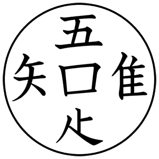
Two weeks ago, sensei was discussing nice-looking characters and compounds that some of the advanced students might want to attempt, and one of her examples was a Zen Buddhist saying commonly found at temples (Google image search will turn up lots of examples). It looks something like this:

This is four characters, not five; the box in the center is shared by the ones around the edges, making the phrase 吾唯足知, or われただたるをしる, which can be loosely translated as “I’m content with what I have”. It’s pretty straightforward, as Zen sayings go, expressing an acceptance of the world as it is, and a lack of desire to acquire more material goods.
So where did this come from?
The Idolm@ster
Just search for it on Google and Youtube. It’s terrifying, in a “do I really need a Japanese Xbox 360 right now” kind of way. If you find yourself downloading the 720p version of the trailer from that German torrent site, all hope is lost.
[Update: this site seems to have the best set of screenshots showing the gameplay. I like the dialogue in this one:

]
[Update: holy crap, that qj.net page is a giant cesspit of Javascript, weighing in at nearly 240K of code, and maybe 2K of actual HTML content. I was initially curious how much overhead the trendy-annoying JS image display code was adding (72K if it’s the only thing prototype.js is used for, 21K otherwise, plus the overhead of actually calling it, which makes the HTML basically unreadable), but now I’m wondering just how painful this site is for anyone with low bandwidth and an older browser.]
