Personal health care, Bad Haiku Edition
hole in arm closing
biopsy was negative
springtime is bike time
fun with Google Maps
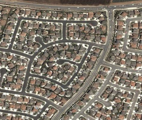
Looks like they ripped out my old apartment building in Columbus and replaced it with something bigger and better. Good thing, too, since it burned down at least once, while I was living there (hmm, now there’s an old Usenet post I should resurrect here; I used to use it as a great counter-example to the “ban guns because they make domestic squabbles fatal” argument).
The concrete canyon Brian and I lived in before that is still there, though, and probably unchanged. Trigger-happy towing, unsafe parking, and next door to a neighborhood pool; a bunch of kids once broke into my car just to steal the change from my ashtray so they could get in. Cute girls running around, though, and our storage closet was big enough to hide a dozen illegal immigrants in. Two dozen if they were close friends.
America’s Largest Community Of Brick Homes hasn’t changed a bit. Nearly 50,000 houses based on four floorplans, so you always knew where the bathrooms were at your friend’s houses. Not the easiest neighborhood to deliver pizza in, especially in Dominos’ 30-minutes-or-free days, but the tips were always good.
As for the first home I remember, Old Powell Road is almost unrecognizable. They got rid of the sharp curves that used to send cars into the abandoned gravel pit (that, along with date-rape attempts, was the most common reason someone would knock on our front door after dark), the formerly-toxic landfill appears to be capped and made pretty, but it’s still sparsely developed. The house is long-gone, but I knew that already.
These days home looks like this:

Is it Engrish if they just didn't notice?
People familiar with Adobe PostScript will recognize the source of this label misprint.
Epson PictureMate 4x6 photo printer
This is a great little product with one serious, annoying flaw. It prints extremely nice 4x6 borderless prints, with excellent color, but even if you send it a picture that’s been formatted to be exactly 4x6, something in the driver or the printer itself is increasing the image size slightly and cropping about 1/8th of an inch on all sides.
This is actually the same behavior people have been getting from traditional one-hour-photo prints for decades, but when you have complete control over the cropping on your computer, it’s a damn nuisance. It’s even more annoying when you’re printing out documents with narrow margins or pictures downloaded from the web.
A quick Google suggests that their tech support folks are clueless about this issue, and don’t actually understand the complaints they’re getting about it. [Update: those complaints must be old. I got a clear, correct response within a few hours. Sadly, it’s a “working as intended” feature, and they don’t mention workarounds]
My guess [confirmed by tech support] is that they’re fudging the image to cope with misaligned paper, so that a supposedly borderless print doesn’t end up having a border on one side. I’m going to create a numbered 1/16th-inch grid in a PDF file and see precisely what ends up on the paper.
Update: Printing this PDF (created by this Perl script) at various magnifications reveals that 95% is just about perfect, but small alignment errors may produce a tiny white border around the edge of photos. The print driver has some adjustments for paper positioning, which should allow you to get perfect, uncropped, full-bleed prints at 95%. Mac OS X applications that use the standard print dialogs should all work with this, including iPhoto.
GarageBand is officially a success
M-Audio has announced this custom controller for it, with matching faux-wood paneling.
I’d love to see the market numbers that drove this decision. Macs have always been big in the creative market, but making custom hardware for an application that comes free with the OS? Hmm…
Update: I’m not exactly a fan of Nine Inch Nails, but any band that releases a track from their upcoming album in GarageBand format for their fans to play with is officially cool.
Drat those domain squatters!
Alleged cat-lovers in Wisconsin are up in arms over a proposed law to allow hunting of feral cats. The web site for their campaign is dontshootthecat.com.
Sadly, shootthecat.com is a slow-loading artist’s site that has no connection to this issue, and doesn’t even seem to have any pictures of cats. Pity. Maybe some bird-lovers should buy the domain from him and highlight some of the unrealistic arguments being made against the legislation.
Personally, I’ve had run-ins with feral cats, and they ain’t the family pet Fluffy. They’re carnivorous wild animals, which makes them at least as big a pest as the gophers and skunks that are already legal to shoot in Wisconsin. More so, probably; I don’t think Wisconsin’s skunks are killing tens of millions of songbirds each year.
I love their support for “trap, neuter, and release”, by the way. If the estimate of two million feral cats in Wisconsin is even vaguely correct, the best they can hope for is weeding out the stupid ones, leaving only the cleverest cats running loose to breed. That’ll fix things for sure!
[Disclaimer: I like cats, enjoy seeing them roaming through the jungle that is my back yard, and once adopted a semi-feral cat who was in danger of being shot by a local farm-owner. I still think it’s stupid and irresponsible to allow them to roam free without a collar or neutering, so I have no sympathy for people who do so.]
A for effort, guys, but...
…I don’t sit twenty feet away from my laptop, and the subject line gives it away as spam anyway:
Dear IRS,
No, I’m not going to send you an additional $35,000 dollars for my 2003 taxes. Do you people even grasp the concept of stock option sales? Did you forget that we just went through this for 2002, and you didn’t get the money that time, either?
Love, J
[kind of makes me glad none of my options were worth selling in 2004…]
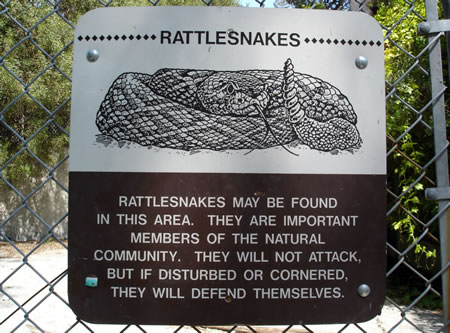
Can we get signs like this for people?

The state of California insists that rattlesnakes have a right to self-defense. What a pity they don’t extend that same right to law-abiding citizens. Perhaps we’re not considered “important members of the community”. (via lgf, etc)
Safari 1.3, two steps forward...
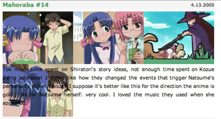
…half-step back. I’m a big fan of the increase-text-size button in Safari, so while I appreciate the definite improvements in the version included with the 10.3.9 update, I have some…issues:

This anime review site displays just fine at the normal text-size setting, but Safari 1.3 persistently hoses the images if you’ve hit the increase-text-size button. Sometimes a forced redraw fixes it, sometimes I have to decrease text size and then increase it again.
Reading and writing Japanese
The most obvious stumbling block for westerners learning Japanese (or Chinese, or Korean…) is the large number of seemingly indistinguishable symbols they’re written in. For Japanese, basic adult literacy requires 2,324. I’m about 10% of the way there, and have been for a while now.
I’m pretty good with the ones I know, enough to puzzle out many book titles and store signs, and I can read short blocks of text with the help of my dictionary, but the real pain was writing each new character out about 100 times. Many years of computer work has left me with both RSI and a lack of “pencil stamina”.
So I switched workbooks. Instead of the solid but strenuous A Guide to Writing Kanji and Kana, I’m now using the Basic Kanji Book. Con: less repetition might make for sloppier handwriting. Pros: less repetition makes my hands happier, it includes reading and writing exercises that put each character in context, and, perhaps most importantly, there’s almost no Rōmaji; it’s assumed from the start that you’ve mastered hiragana and katakana.
With this book, I very quickly learned that my ability to write the characters I had learned degraded rapidly. Even some kana required conscious effort to remember, despite my ability to read them. So, switching workbooks has helped me out even more than I originally expected.
For additional practice, I went back to Level I in my Rosetta Stone courseware and switched to the writing exercises. It doesn’t support a real Japanese Input Method, but it does have a very good sentence-assembly drill, sort of a Kanji Scrabble quiz (see a picture and hear a phrase that describes it, then select the right characters to transcribe the phrase from a set of tiles). It’s quite effective.
The only problem with it is that they don’t use your platform’s native font rendering, so you’re stuck with bitmapped fonts at specific sizes, and even at the largest size, it’s difficult to differentiate between 一 and ー on the tiles. Yes, they’re different, and yes, the software will beep haughtily at you if you pick the wrong one.
Cirque de Soleil: Kà
I kept waiting for something impressive to happen.
This is not a good sign when you’re dealing with a troupe whose reputation is built on delivering something impressive. Kà is entertaining, but if you’ve seen any of the other three Cirque de Soleil shows in Las Vegas, it’s a bit of a letdown.
What’s wrong? First, the lack of any “wow” moments; they deliver a number of decent pieces, loosely strung together by a half-page of storytelling, but nothing that really stands out. Second, the attempt to pass off the usual acrobatics as stylized combat; half a dozen scenes were marred by dreadful “fight” choreography. Third, the balance between technical gimmicks and artistry was weighted heavily toward the former; it looks like the production was built around the hardware, not the other way around, and much of it seems to be used simply because it’s there.
It can’t be a coincidence that the director of O and Mystère was off working on a show for the new Wynn Las Vegas casino…
Did it suck? No, it’s just not worth planning a trip around yet. There are plenty of talented performers in the show, and the sets are technically impressive; once they arrange a proper marriage between the two, they’ll have something. Except for the combat scenes; those really did suck.
[other shows this trip? The reliably terrific Blue Man Group, and the mostly-amusing George Carlin; his political material has always been weak, but the farther the rest of us get away from the early Seventies, the harder he tries to drag us back there. “No thanks, Uncle Dave”]
