“…everyone else just throws a tantrum when their articles aren’t replied to. You have to bring up artistic integrity.”
— Jeff MeyerLol, cats
Sankaku Complex is a non-worksafe site that mostly posts pictures and stories related to anime and idols, with an affection for certain common Japanese fetishes that I do not share. That is, I visit for the adult models wearing bikinis and less, and run away screaming from their lolicon-bait.
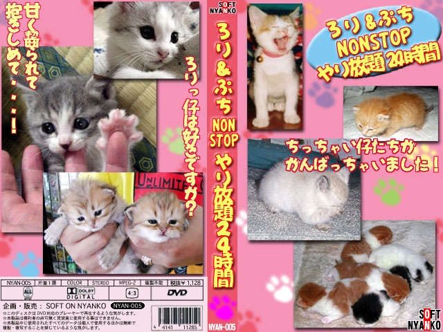
Posting this little number makes up for all their sins:

Transcribed and roughly translated:
- ろり&ぷちNONSTOPやり放題24時間, "Rori & Puchi non-stop doing whatever they want for 24 hours"
- ちっちゃい仔たちががんばっちゃいました!, "These tiny kittens gave it their all!"
- ろりっ仔は好きですか?, "Does L'il Rori like it?"
- 甘く齧られて抱きしめて…!, (sweetly/lightly) (have something nibbled) + "hold me"
I’m not sure what to do with the passive te-form of the transitive verb kajiru “to chew/gnaw/nibble on something” in that last one. The kitten’s the one doing the gentle nibbling, but then she’s asking you to do the hugging. If the intent is “let me nibble”, I think it has to be causative “give me your causing me to nibble” rather than passive “give me your being nibbled”.
Loli Cute?
As I mentioned earlier, I think Erika Yazawa is very cute. She’s also rather stacked (34E-24-34, at only 4’11”), with an on-screen persona that’s as bouncy as her barely-restrained chest.
However, her latest photobook says, right on the cover, “loli-cute looks and 88 bust with G cups”. Sorry, but I’ve found a lot of pictures of her (coughcough), and even in her debut at 15 in Idoling!!!‘s first video two years ago, she didn’t look particularly young (no higher-res streaming version available, but there’s a download link off of Acchi Muite Pie!!! (named after a common event in their tv show)).
Cute? Definitely. Loli-cute? Um, no. I’d be a lot less interested if she were working that end of the fetish aisle.
Mercury ticker
It is currently 34 degrees Fahrenheit in my neighborhood. At 8:30am. In central California.
Apparently global warming is tied to the stock market.
Dear Steve Ballmer,
I know you’re rich enough to afford the best drugs, but you really shouldn’t take them right before giving an interview (emphasis added):
"You know, they like to act like Macs are lightweight, there are much lighter weight PC notebooks. Macs—do they have the best battery power? Of course they don't have the best battery power. Macs tend to have nice screens, but can you get nicer screens for a PC? Of course. Do Macs work in business? No, they do not. Can you get Macs made in your own country? Because in some countries, there's a lot of sort of, you know, what do you call them? Import duties? Taxes? You can't get Macs made in those countries, they make them basically one place in the world, and therefore they get even more expensive.
"You know, there are so many—you know, can you find Macs in—I'm very sensitive to exactly what mouse I have on my laptop. Can you find a range of choices? Of course you can't find a range of choices. You know, anyway—can you find the applications you want on the Mac? Well, you don't really get full Microsoft Office. Everything from Apple is available, there are still tons of business applications and there's games—anytime somebody does client software—over time they'll do a Mac client. Maybe nowadays people do the Mac clients mostly to save time, but that's only on the high-volume applications."
Maybe I should remind Steve about the years that I ran 600 Solaris servers for him from my PowerBook. With a Microsoft Mouse attached…
He’s right about Office, though. Whose fault is that, anyway?
42
Ah, the joy of random surfing. How else would I come to know that the novel published in English as “Life, The Universe, and Everything” was released in Japan under the title 「宇宙クリケット大戦争」, or “The Great Space Cricket War”.
Please don't disappoint me...
[Update: threw them away. They may have used the right flavoring, but they used maybe half as much as they should have, on an inferior chip.]
This had better not be one of those “New Coke” deals. I get mean when somebody replaces a classic with inferior crap.

PS: Never visit doritos.com. The term “steaming pile of Flash” was coined specifically to refer to that sort of content-free bullshit.
Pretty Girls + TV Show - Voice Training = Idoling!!!
I’d like to support Fuji TV’s pet idol group Idoling!!!, and it’s true that with sufficient voice processing, their singles are pleasant to listen to, and quite catchy, but I could never watch their show. Never never.
This video explains why. Be sure to watch the high-quality version to get the most out of the eye candy, and keep your hand near the mute button to protect your ears. There’s no voice processing for the show, you see, so you hear what the girls really sound like. And most of them are awful, making the worst of Hello!Project sound good.
In their defense, the show is pitched as a boot camp for aspiring idols, and they spend more time getting hit in the face with pies than they do singing. None of them have solo CD releases, but several have DVDs and photobooks, and there are a few calendars as well. Unlike Hello!Project, the girls are from a number of different agencies, and most of their promotion isn’t tied directly to their presence in Idoling!!!.
In looks, they range from cute to stunning. Two of the first-season girls who stand out are the tall, Western-looking Rurika Yokoyama and the short, busty cutie Erika Yazawa (who must need an icepack after every performance; honey, if they won’t buy you a bra, bring your own. Then again, you’ve got three solo DVDs, two photobooks, and a calendar, so “never mind”).
