Games
A glowing victory
Things not to do in Civilization III: detonate 270 ICBMs in one turn, blasting every other civilization back into the stone age (or at least to cities of size 3 or below).
Why shouldn’t you do this? Because the resulting global warming took fifteen minutes to resolve. That’s fifteen minutes each turn, for the rest of the game. Fortunately, there were only a few turns left, as my Modern Armor rolled across the countryside razing cities. Then I signed peace treaties with the survivors.
Belatedly, it occurred to me that this is the sort of behavior that the folks in Berkeley and Hollywood are expecting from the current administration.
Big food
A relatively constant factor in my life is the weekend gaming/cooking session with friends. We have a large stable of entertaining games from companies like Cheapass, Steve Jackson, and (pre-Hasbro) Wizards of the Coast, and an Xbox or two. The recipes come from a variety of sources, including my still-under-construction online cookbook, built from assorted MasterCook-format archives.
This weekend was at my place, which gave me an excuse to do some massive house-cleaning and show off my newly-completed landscaping. Since I had so much cleaning work to do, I insisted that the meal should be relatively simple, which meant steaks.
Arcana Unreadable
Picked up a copy of Monte Cook’s Arcana Unearthed over the weekend, in case our group wanted to try it out sometime (D&D 3.5 went over like a lead balloon), and discovered that, while Monte may have learned a great deal from the rules mistakes in 3rd edition D&D, he has definitely not learned from the layout mistakes.
- the font is smaller, with a small x-height.
- the headers stand out less from the body text.
- the body font uses lower-case numbers (similar to web font Georgia, for those who aren't up on type jargon) so they blend in with the surrounding words.
- new sections still start in the middle of a column, so you have to hunt for things like character types.
- the index, while comprehensive, is set in italic sans-serif, so it's extremely hard to read.
- the index is also set with negative leading, so the page numbers in multi-line entries overlap slightly.
The only nice thing I can say compared to the WotC D&D books is that the page backgrounds aren’t crufted up with “spiffy” graphics, so you have black text on a white page. That high contrast, along with the generous leading, are all that saves it from complete unreadability. 3M Post-It Flags are all that can save it as a reference manual; you’ll never find anything quickly without them.
He does offer it as a PDF, which would be great if it weren’t for the tinyfonts. I suspect it would be quite readable blown up to fill a 20” widescreen display, but not on anything smaller. Blech.
Updates: I’ve found some more layout errors to be annoyed by.
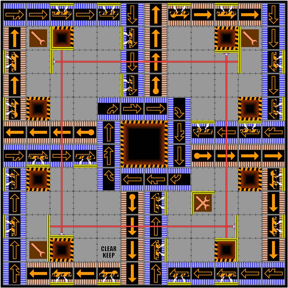
Custom RoboRally boards
I think everyone who ever played RoboRally has toyed with the idea of making their own boards. Indeed, a quick Google will turn up dozens of sites devoted to fan-made boards and editing tools. I tried using a few of them, but the tools were clumsy and the results uninspiring.
So I did it in Adobe Illustrator, and my first original board looks like this.
D20 initiative cards
A lot of folks track combat order in D&D with index cards. I don’t know who the first person was to think of making custom index cards with a pre-printed form on them, but I first saw it at The Game Mechanics web site (great people, unfortunate choice of names).
I had just gotten back from a con where we’d run a four-party adventure with a total of five DMs, 24 players, and umpteen monsters, and the freeform index cards we used just weren’t good enough. I didn’t like the actual layout of the TGM cards, but the concept is great, and the rotate-for-character-status mechanic really improves the flow of a large combat.
My response was, of course, to come up with my own layout, adding fields and spot color to make them more useful. Along the way, I decided to increase the size from 3×5 to 4×6, greatly increasing the available space. TGM’s original cards, along with instructions on how to use them, can be found here; their forums also have several lengthy discussions on the subject.
My latest version is here. Several people have argued for a double-sided 3×5 version, and I’ve prototyped one here.
Printing Note: Acrobat has two settings that can make it annoying to print odd-sized documents: “shrink oversized pages” and “enlarge small pages.” Turn them both off if you want the cards to come out the right size.