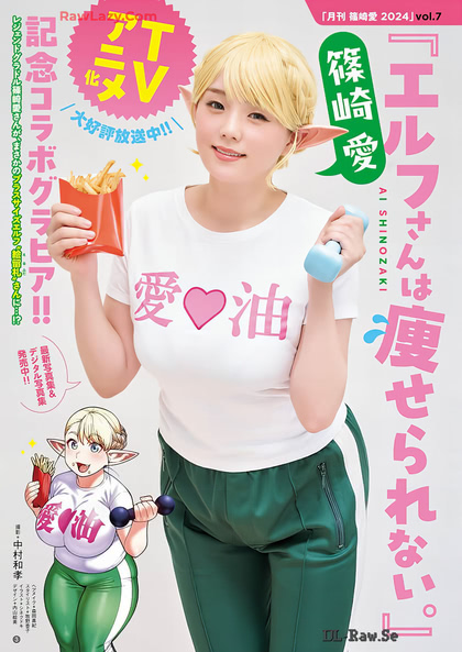
2.5D...
Finally, a reason for the Chubby Elf series to exist:
So Ai Shinozaki can cosplay her (site not safe for work or Javascript):

…without the “chubby” part…

Drinks I won’t buy again…
Before I bought my SodaStream, I was a regular consumer of the Sparkling Ice pink grapefruit drink. It was always a hassle to find an adequate supply in stock locally, largely due to the same problem Snapple has: shipping mixed cases to push flavors that don’t sell.
Recently, they released a bunch of branded Starburst flavors. I bought a few, and I regret doing so, because they tasted like melted creamsicles.
Accessibility Lite
So I sent feedback to the author of Typeface, and he already had a beta update that increases contrast. Good: I can now read the nearly-black-on-nearly-white tinyfonts in the sidebar, and usually tell the difference between the dark-gray inactive tiny dot and the blue active tiny dot. Not so good: the nearly-black not-in-font placeholder characters are basically impossible to distinguish from the black preview characters. So, baby steps.
He also asked what I meant about wanting more detailed views, so I fired up FEX for some screenshots that demonstrate the difference between visualizing fonts and managing them. We’ll see what comes out of that.
File under amusing that while the normal state of font activation is two slightly-different tiny dots, hovering the mouse over the dot changes it to a larger distinctive icon showing the state you can toggle it to (minus-sign if it’s currently active, sunburst if it’s currently inactive). There’s also a padlock to indicate system fonts that can’t be deactivated, which you almost never want to see, and can filter out by the obvious method of Option-Right-Clicking on the “Font Book” collection in the sidebar and selecting “Add inverse to filters” (or manually typing the equally-obvious “#!//font-book” in the search bar).
Comments via Isso
Markdown formatting and simple HTML accepted.
Sometimes you have to double-click to enter text in the form (interaction between Isso and Bootstrap?). Tab is more reliable.

