Dear Amazon,
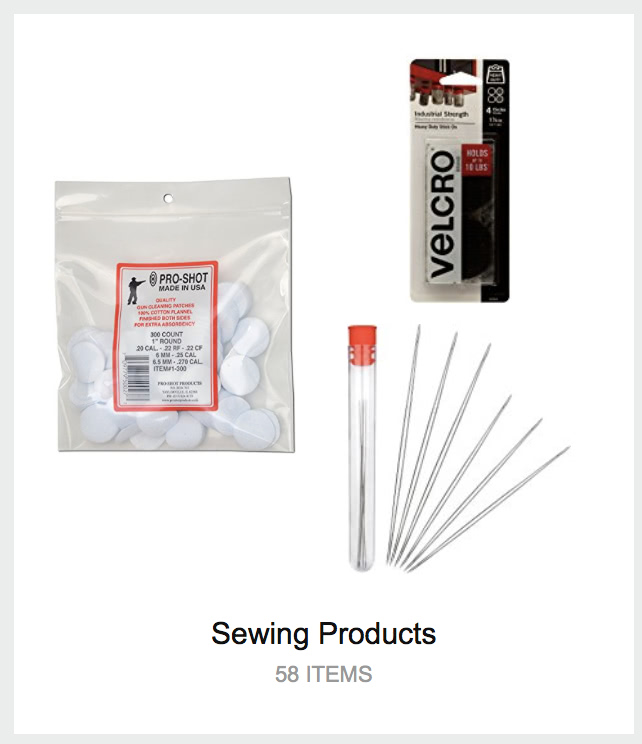
The reason I miss the old “recommended for you” paginated, categorized list is that your new tag-tile system constantly throws up nonsense like this:

Bottom line, the behavior that your new tile system encourages is anti-browsing: if the picture on a tile isn’t something that I want, I won’t click on that category at all. For now, it’s still possible to get the old list view for new and upcoming releases, which you don’t (usually) have a tile for, but the URLs aren’t visible on the site any more.
I should also point out that the tile system makes it much harder to improve recommendations. Old and busted: for each item, click “I own it” or “Not interested”. New hotness:
- click a tile
- click “View All & Manage”
- click “Edit Recommendations”
- click “Remove” on an item
- click either “I already own this item” or “I’m not interested in this item”
- wait for the thumbnail image to load, because your next click might not register when the layout changes
- click “Ok”.
- Repeat steps 4-7 for each item from that tile, then scroll back to the top and click “Yournamehere’s Amazon” to get back to the tag-tiles screen.
This, in a word, is bullshit.
Comments via Isso
Markdown formatting and simple HTML accepted.
Sometimes you have to double-click to enter text in the form (interaction between Isso and Bootstrap?). Tab is more reliable.