Dear Amazon,
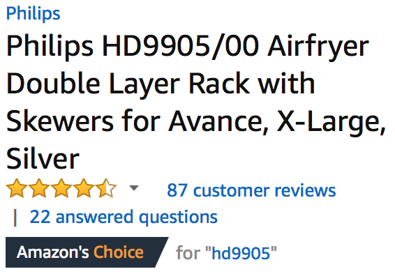
Recently, the following graphic has been showing up on a lot of products:
At first glance, it seems like it’s saying “we think this is the best product of this type”. But then you start to notice:


Doesn’t really mean much now, does it?
Comments via Isso
Markdown formatting and simple HTML accepted.
Sometimes you have to double-click to enter text in the form (interaction between Isso and Bootstrap?). Tab is more reliable.