Housefail
I do not want to buy this house.
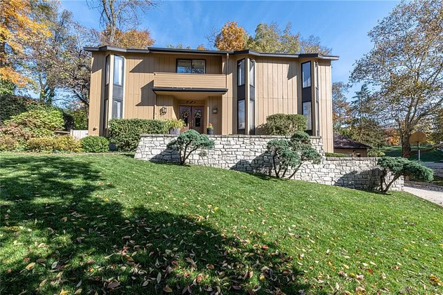
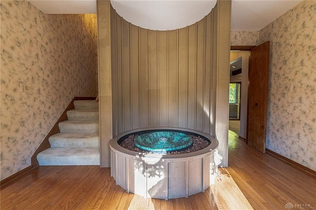
You might think I dislike the architectural statement being made (and you’d be correct), but that didn’t stop me from looking further, because it’s a brisk walk from my parents’ place. It’s kind of crammed into the front of the lot, so it’s closer to the neighbors than I’d like, but the landscaping compensates pretty well to provide privacy. The front windows got a raised eyebrow, but the first hint that this one was going to be special came from the water feature in the foyer.
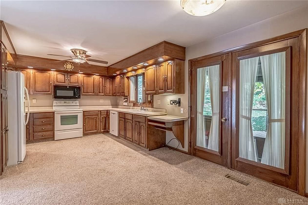
That one got a big eye-roll, but the first thing to really make me cringe was the wall-to-wall carpet in the kitchen. That was so distractingly awful that it took me a while to notice the black microwave oven/range hood in the middle of the all-white appliances.
Then came the wallpaper, followed by the wood-paneled walls, the painted-on walls, and more wallpaper, but I was still recovering from the kitchen, so they didn’t have much impact. Until I reached the basement.
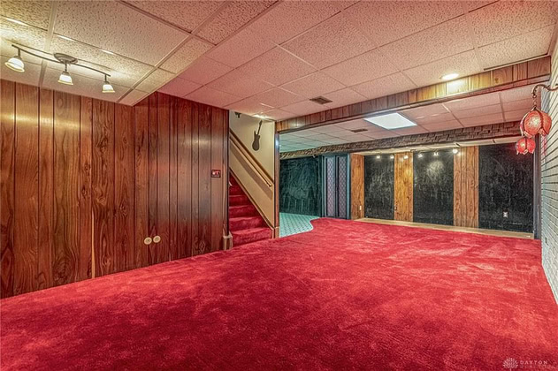
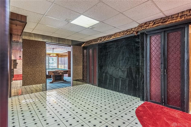
The carpet! The tile! The paneling! The shingles! The cork-and-mirror wall! The doors! The WTF-is-that, slate? The… dear-god-is-that-tartan?!?
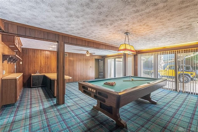
This left me numb, so the wall-to-wall carpet and hawaiian-shirt wallpaper in the laundry room just made me twitch a little.
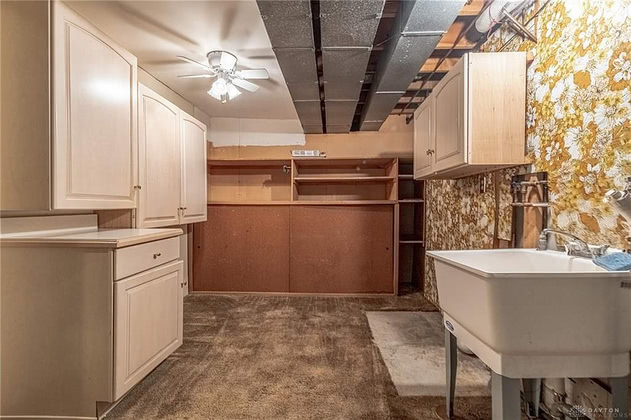
But just for fun, take a close look at that cabinet on the left, and try to figure out why there’s a six-inch gap above the counter. I understand why the cabinets behind it aren’t higher up: the ceiling fan would smack into them. But why not put the near one higher up so you could actually fold clothes on the counter? It already doesn’t match the others, so why not go for broke?
Comments via Isso
Markdown formatting and simple HTML accepted.
Sometimes you have to double-click to enter text in the form (interaction between Isso and Bootstrap?). Tab is more reliable.